How to Create a Harmonious Colour Palette Every Time

Don’t have time now? Pin for later!
“The question is, how to create such a harmony if you’re not so great with colors as Van Gogh.”
– NK asked me in my blog post on color harmony
Indeed, old masters make it look effortless, especially because we get to see only the very best of their best work. Van Gogh created around 900 paintings during his life, whereas only a handful is widely known.
But what can we learn from him? Van Gogh was a true student of nature. Throughout his life, he spent days painting outside, preferring to be in the element instead of working indoors.
It's hard to believe now, knowing Van Gogh's signature vibrant yellow and blue, that his early works were dull brown. It's through observation and practice that the painter became comfortable and skilled with using bold colors.
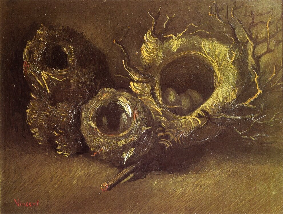
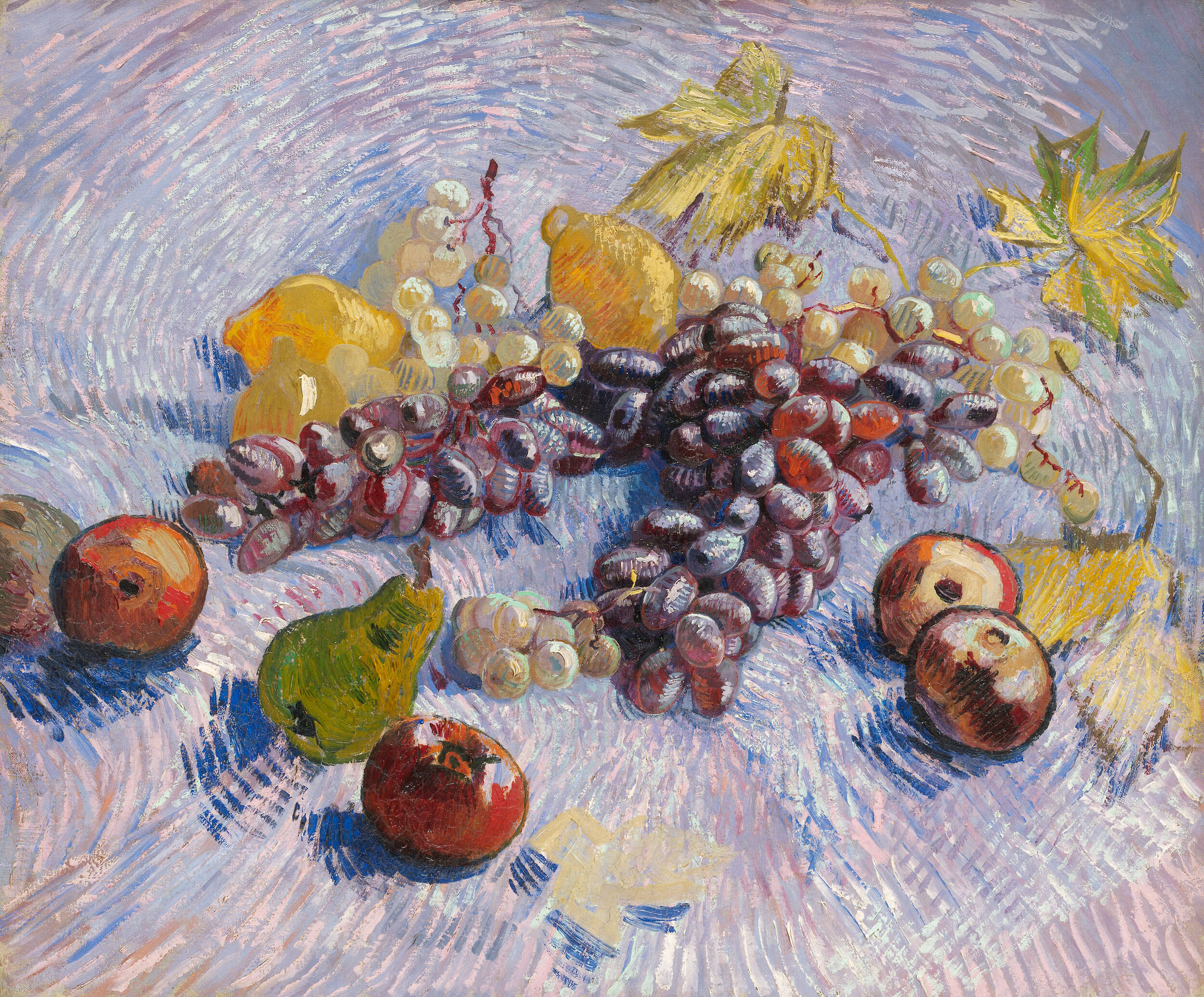
Still Life with Three Birds Nests and Grapes and Lemons, Pears, and Apples by Vincent Van Gogh
Like Van Gogh, we can study how nature shapes the world, how it moves and changes with time, and how it paints it. Nature is the oldest artist, the most fierce and daring of all.
Next time you're out in a park, forest, or out in the countryside, look at how nature plays with color. No matter what you're searching for: gentle transitions or bold combinations, eye-catching pairings or unusual gradients – nature has it all!
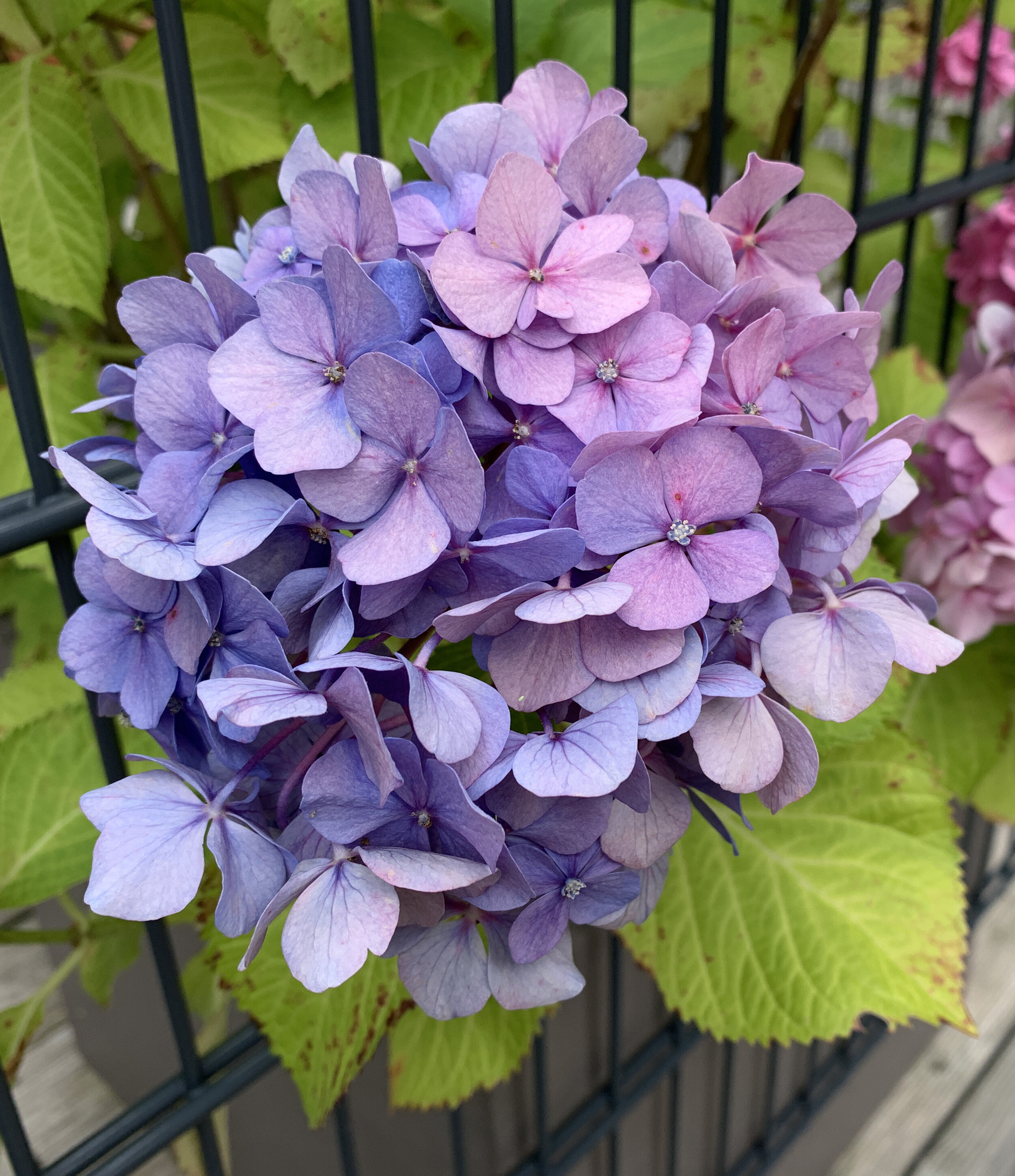
My personal collection of natural color references
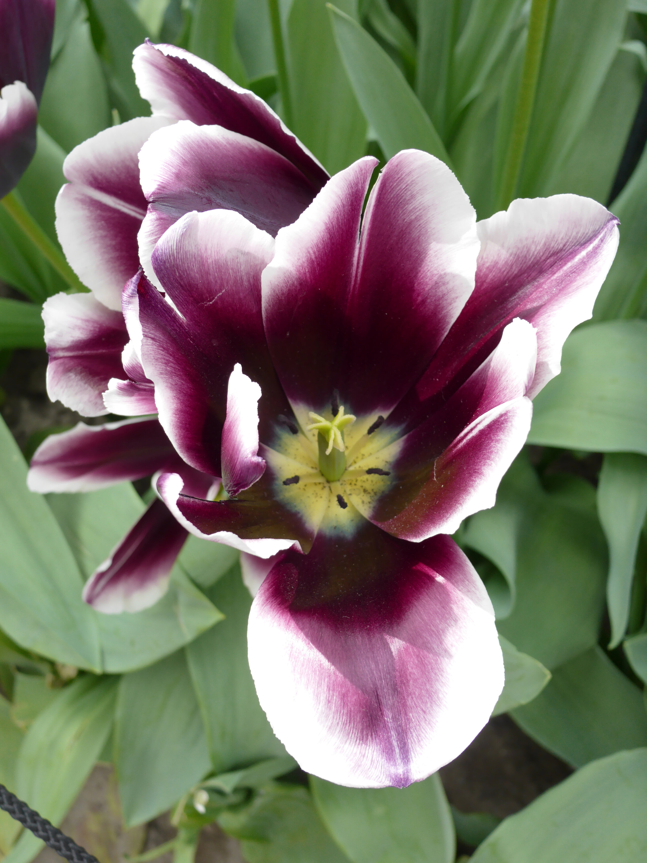
Notice how green varies from flower to flower. Warm, vibrant daffodils are paired with warm, lush green leaves, whereas cool pink tulips have matching blue-green leaves. If you look close enough, you'll see the same shift in browns, and each time it's matching the greenery.
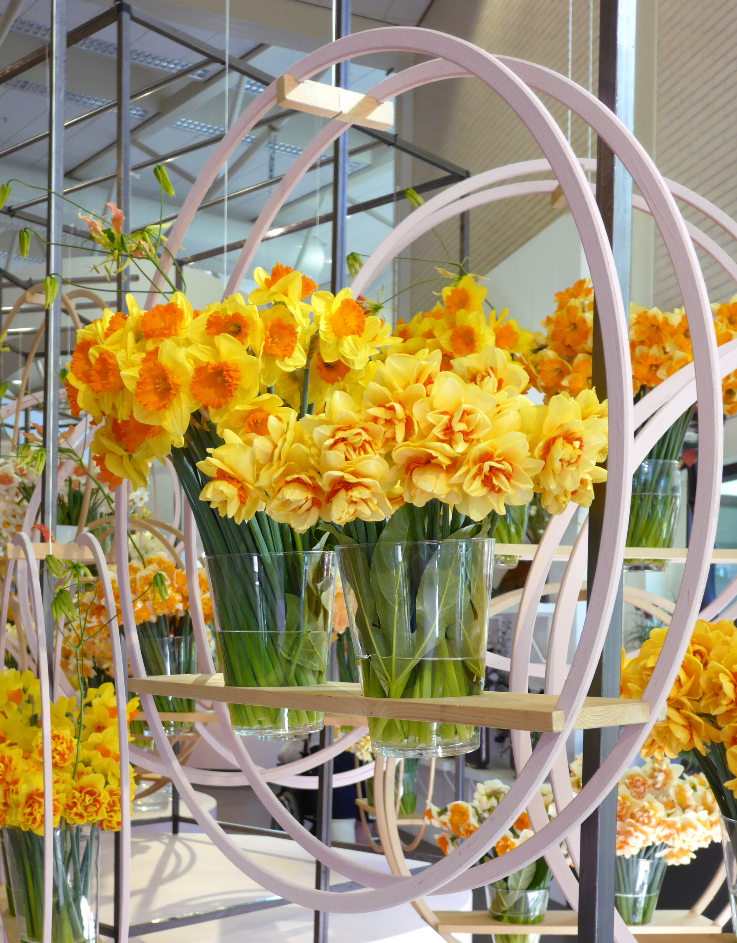
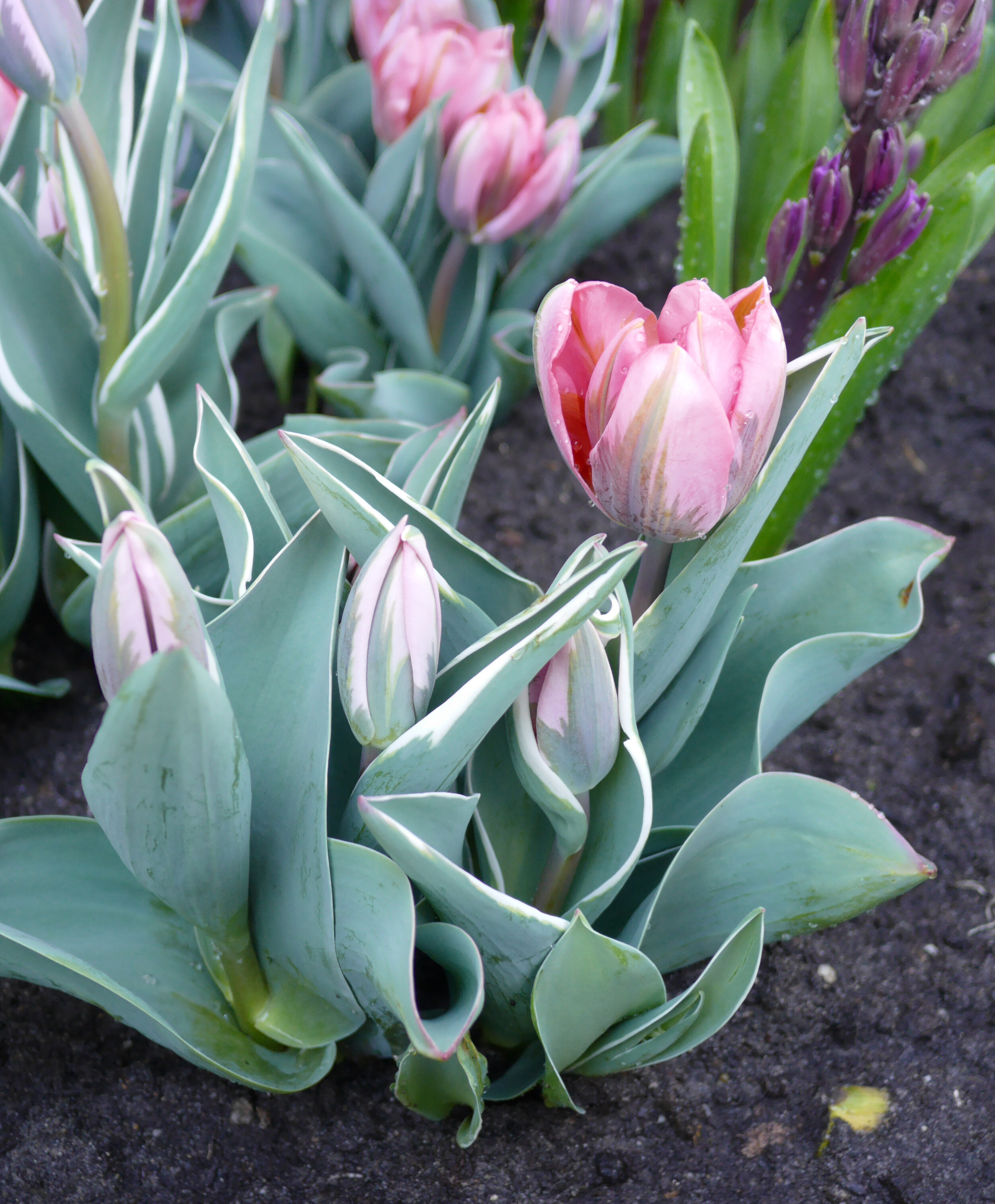
Daffodils and tulip from my personal photo collection
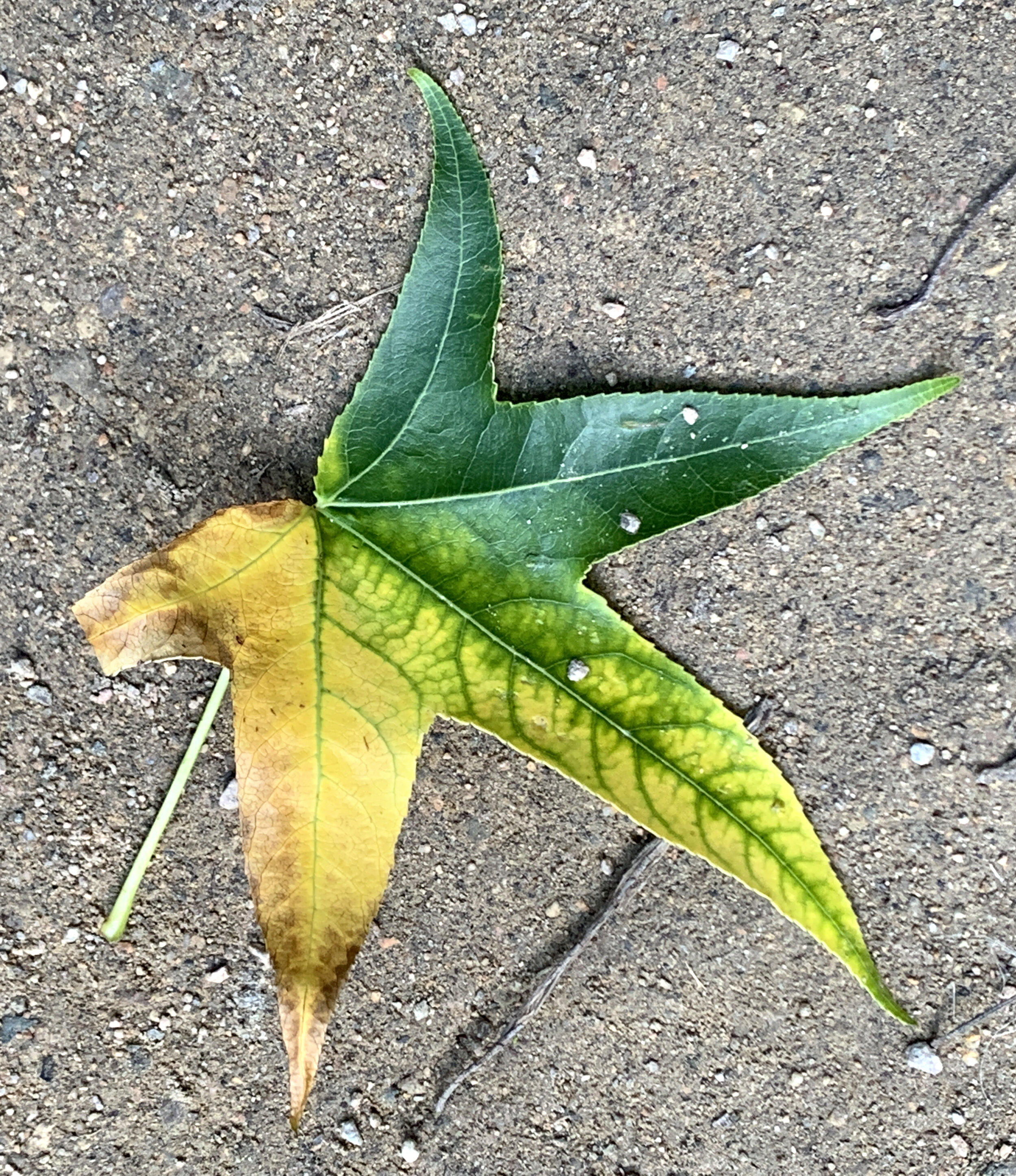
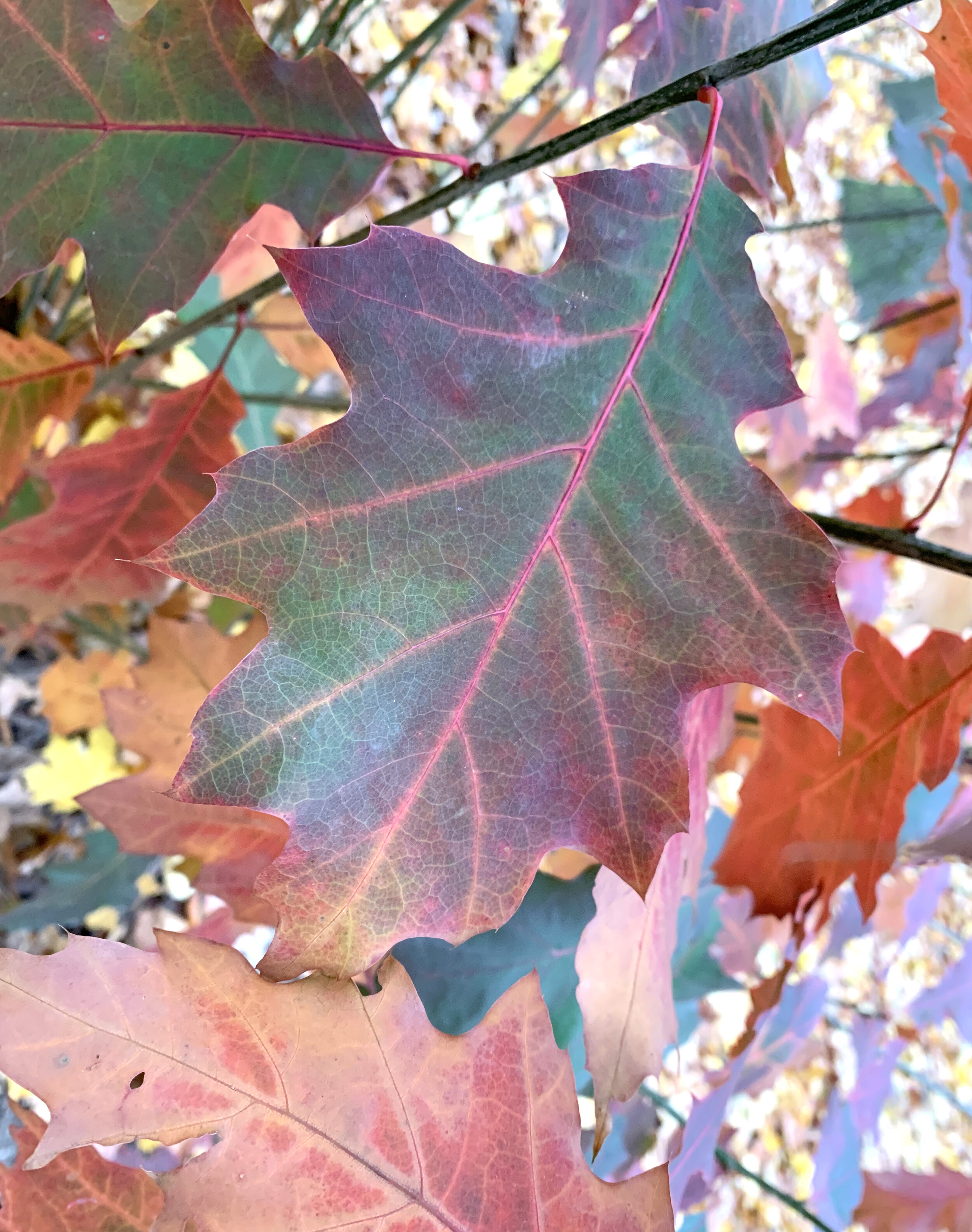
When autumn comes and leaves start changing, those new vibrant yellows, oranges, and reds look right against the green backdrop. They don't clash but instead bring out the best in each other.
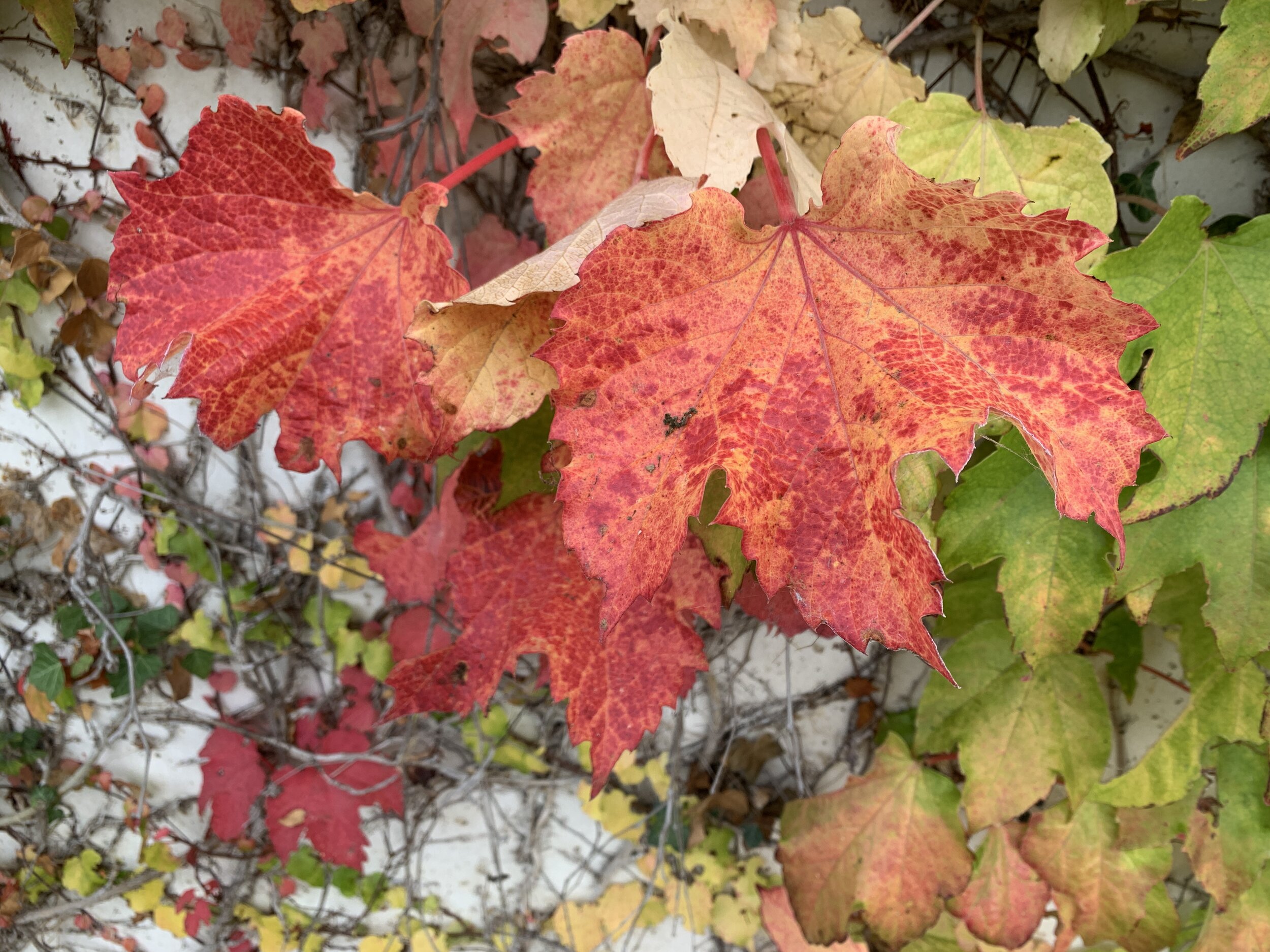
How leaves change in autumn
Take pictures to collect those color combinations so you can apply them to your work. If hues create harmony, it doesn't matter what subject they are used for.
Which of the color combinations above is your favourite?
P.S. Join ColorTamers to learn more about using color in your art.
Keep creating!
Yours,
Tatiana
You might also enjoy
Hello!
My name is Tatiana Kuvaldina.
I am a color expert.
My purpose is to help creatives like you to build their confidence one color exercise at a time.
Let’s talk more on Instagram
Find me @tkuva_illustrates