
7 Common Mistakes When Choosing Colour Schemes and How to Fix Them

Don’t have time now? Pin for later!
Having a wide range of options is great, isn’t it?
Not really. 3 is an optimal number of options, that’s why you often find ads with 3 similar products in a different price range.
When it comes to colours, your options are endless, and that’s tough. When you have that many possibilities available, it becomes a daunting task. “What if I made the wrong choice?” and similar questions pop up in your head.
To make your choice a bit easier, I looked at 7 common mistakes that creatives make when choosing colour schemes.
1. Using too many colours
The more colours you have, the harder it is to harmonise them. You can easily get lost in them and how they relate to each other.
If you struggle with colour, start small. Choose one main colour and go from that. Then find the second one that works great with the first and works for your idea. Repeat this process until you have enough colours to bring your vision to life. One core colour is already enough to create. Monochrome works of art existed for as long as humans did. 2 colours make a classic combination like black and white or black and red.
2. Not taking colour amount into consideration
Often in colour palettes, all colours are shown as rectangles of the same size. However, they should also depict the amount of colour to be used.
Look at these 2 paintings. They both have similar blue and yellow, but the amounts of these colours vary a lot. One painting is dominated by yellow and orange, whereas the other one is primarily blue.
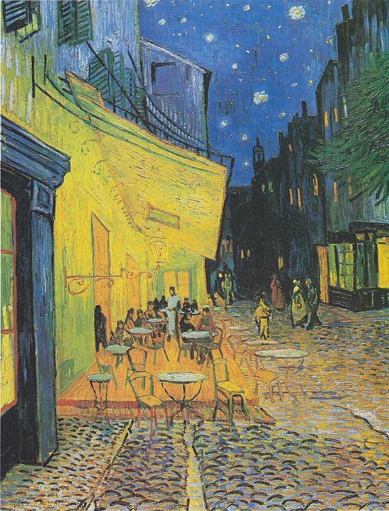
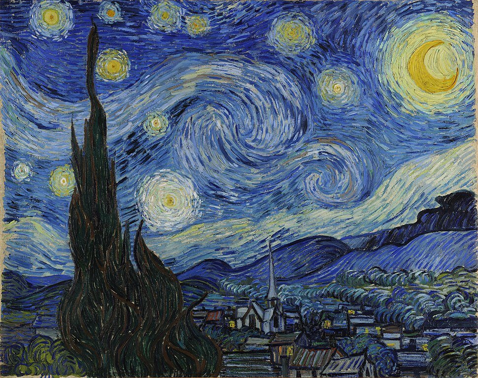
Paintings by Vincent van Gogh: Café Terrace at Night and The Starry Night
If you don’t take colour quantities into consideration, you can present their colour palettes as nearly the same. However, you can see how the colour balance affects the overall perception of these art pieces. It influences our feelings making café scene warm and welcoming, whereas the night landscape appears cold and distant. That’s why when creating a colour scheme make each rectangle proportional to the area that colour will take on a finished piece.
3. Forgetting about paper colour
If you intend to leave a part of your background untouched, its colour should also be a part of your colour scheme.
It can even be the colour taking the largest part of the artwork, despite not being the core colour.
4. Being rigid with the number of colours
Unless it’s a requirement for your project, don’t start with the exact number of colours in mind. You limit yourself before you even start.
Try the other way around: go from your idea to colour harmony and only then to the exact number of hues.
5. Putting each and every colour variation in the colour scheme
It’s common during the painting process to add variations to your pre-chosen colours. Look at your colour scheme as a skeleton, your guideline to follow during the process, but don’t let it limit you to the extent that you can’t work.
You can use variations of the colours you’ve chosen, adding gradations as well as mixing new colours from your selection. Imagine trying to catalog every single hue used in any of impressionistic paintings; it’ll take ages. Trying to do it in advance is the way to never start your project.
6. Being afraid of making any changes
You may be in love with your colour palette, but it can still be not the right fit for the current project.
Save it for later and do what’s best for the artwork. Change lightness, saturation or even replace colours altogether, so you can better express your idea through colour. Some colours may just not work for what you’ve intended. It’s OK. It happens. Getting hung up on a specific colour scheme doesn’t let you explore and prevents you from finding even better ones.
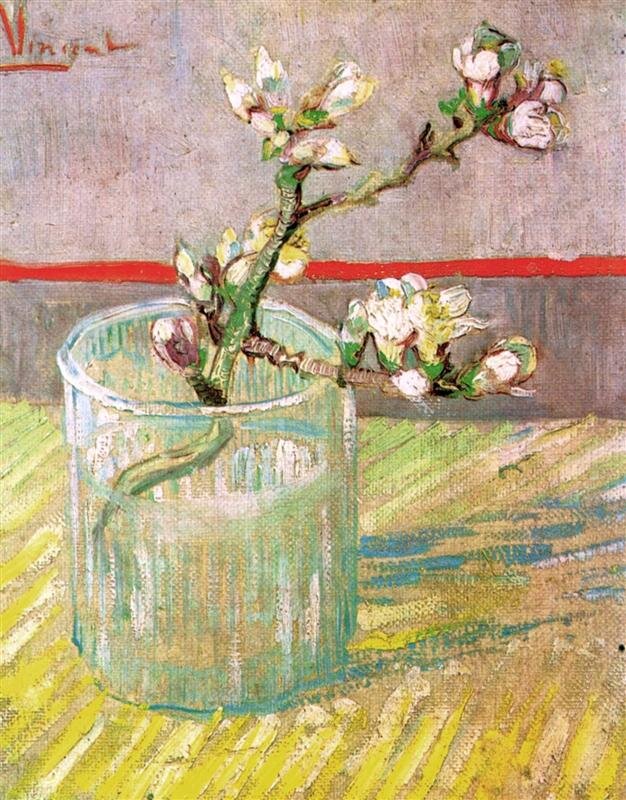
7. Linking the amount of colour to its importance
Sometimes a drop of colour is all it takes to bring the piece together.
This hue can take less than 5% of the whole colour amount but still be crucial. Your colour scheme has to reflect that. Usually, such a colour is used to make an accent. It gives liveliness to artworks and helps to bring viewers' attention to the right area.
Look at the image below. Bright red changes the whole painting by adding tension to otherwise gentle still life. Although, red takes only a tiny percentage of the overall colour quantity, it’s crucial for the colour scheme. Without it, it’d be a completely different painting.
Which of these mistakes have you made? How are you going to avoid them next time?
P.S. Join ColourTamers to get more tips on colour every creative needs.
Keep creating!
Yours,
Tatiana
You might also enjoy


Hello!
My name is Tatiana Kuvaldina.
I am a colour expert.
My purpose is to help creatives like you to build their confidence one colour exercise at a time.
Let’s talk more on Instagram
Find me @tkuva_illustrates


